

.gif)


Oops! Something went wrong while submitting the form.
The Guest Book
OVERVIEW
Redesigned email campaigns, social ads, and internal sales materials for hotel booking app The Guest Book. Focused on refreshing the brand’s visual language with a modern, clean look that supported both user engagement and internal sales efforts.
YEAR
2023
SERVICE
Email Design
Design that checks in before you do.
REGION & ZONE

Refreshed the brand’s visual identity through clean email campaigns, social ads, and sales tools. Helped connect users to better hotel deals with design that felt trustworthy and modern. Kept things simple, clear, and ready to convert.
ABOUT
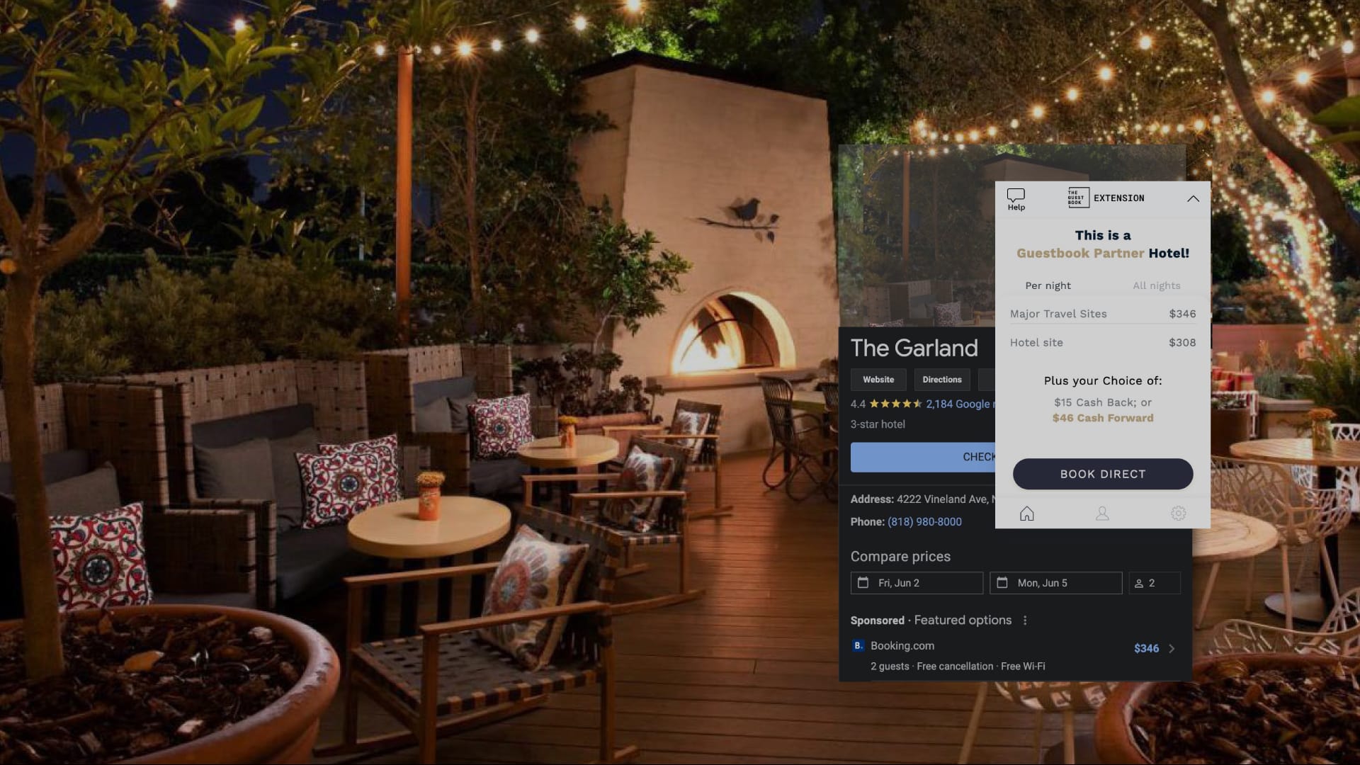
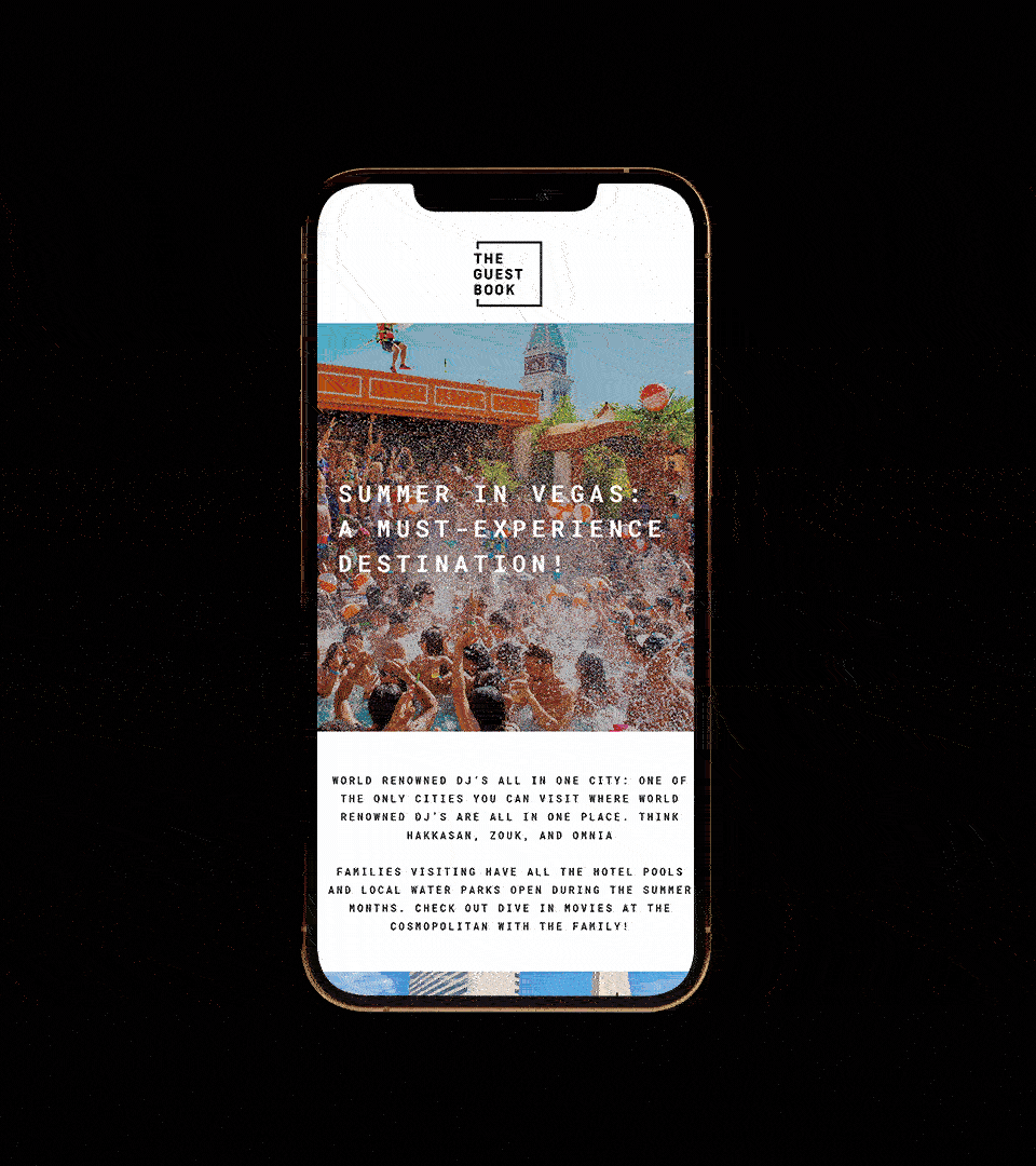
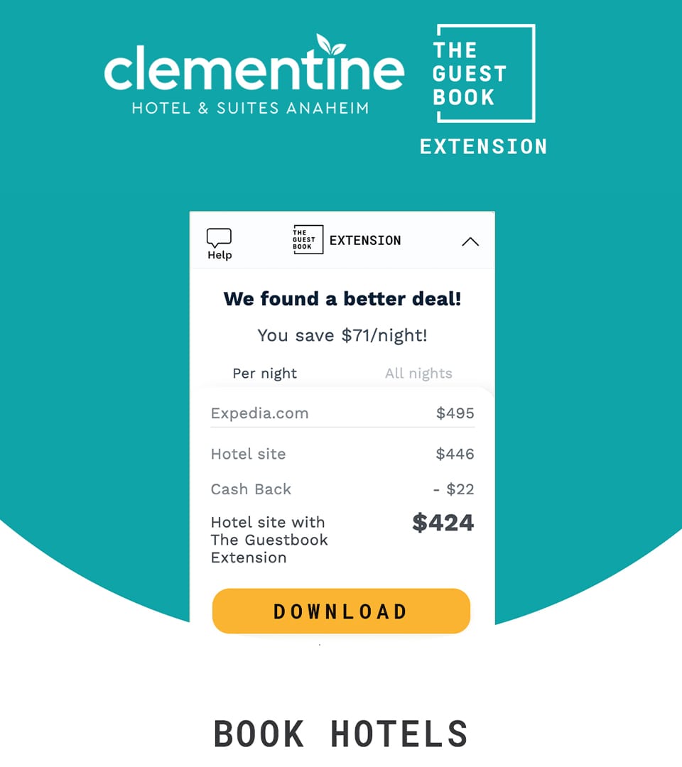
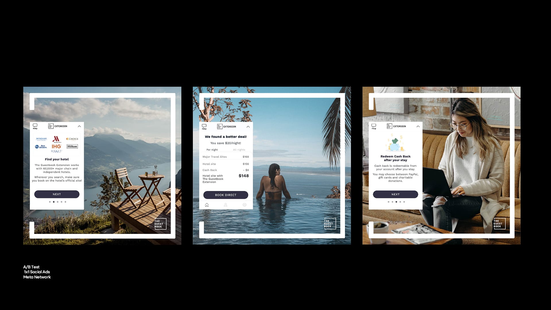
At The Guest Book, I stepped in to refresh the brand’s visual communication across both external and internal channels. The platform helps users find better hotel deals through cashback and loyalty rewards, so the messaging had to feel clean, trustworthy, and modern—especially in a space that’s crowded with offers and noise.
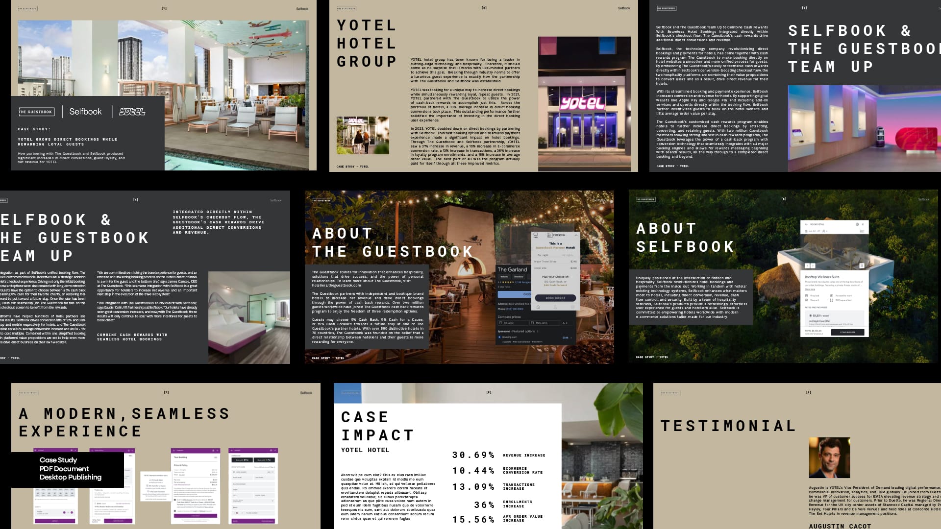
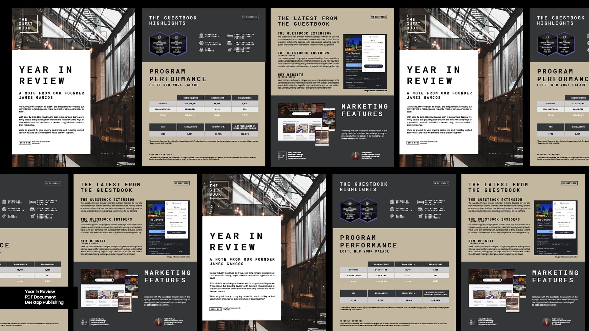
In addition to public-facing work, I also supported their internal teams by designing sales decks, pitch presentations, and case study templates. These tools helped the sales team speak to both hotel partners and potential users with more consistency and confidence. It was about giving them a flexible system they could easily update, while still feeling on-brand.
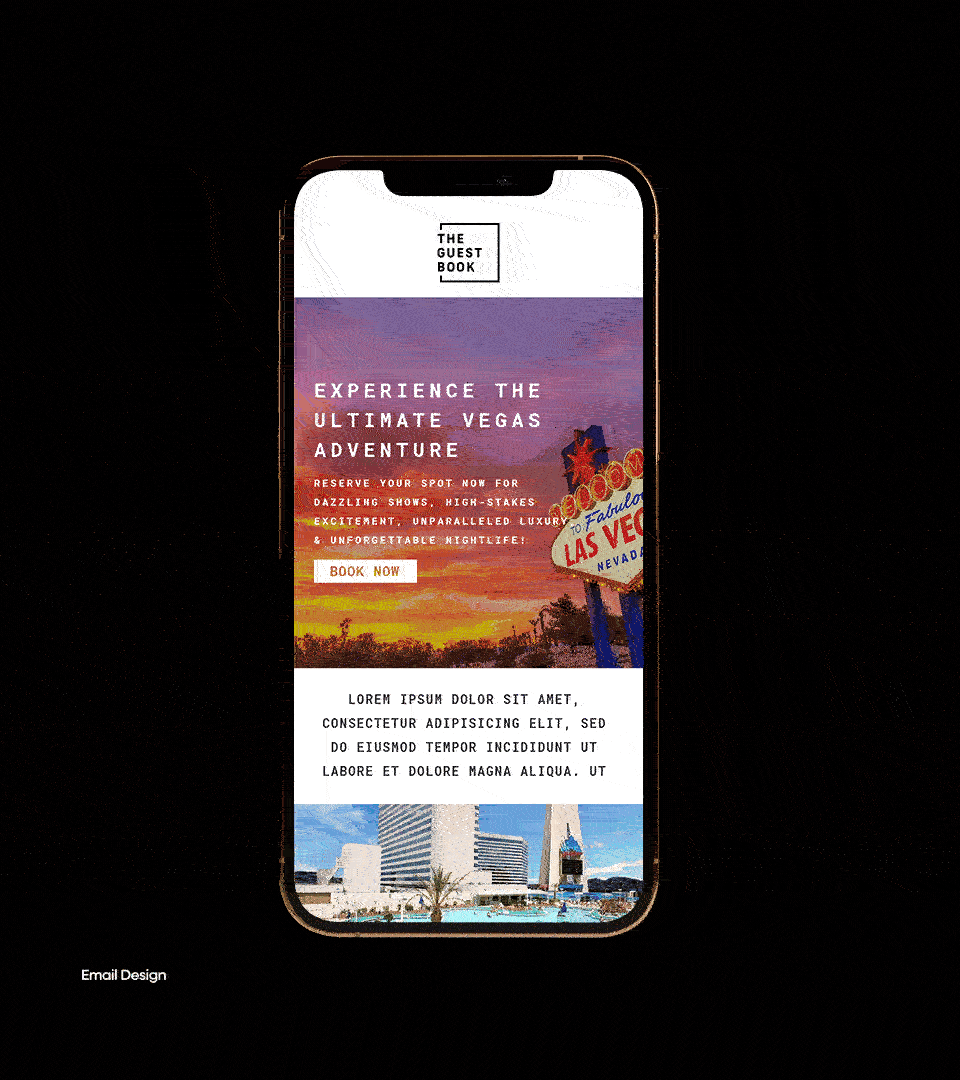
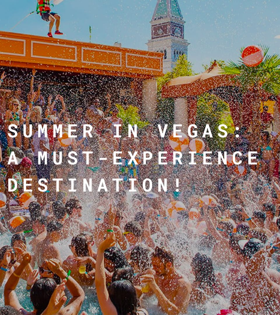
I focused on updating their email campaigns and paid social ads, giving them a look that felt more current and user-focused. The goal was to keep things simple but sharp—enough polish to feel premium, but not so slick that it lost relatability. We leaned into clear value messaging, minimal layouts, and smart use of brand colors and photography.
The work didn’t require overthinking—just solid execution and an eye for clarity. Everything was made to help people move quicker: faster bookings, faster reads, faster conversations. It was the kind of project where clean design made the most impact.
Email
Ad Campaign
Socials
FEATURES


No items found.