
.gif)


Oops! Something went wrong while submitting the form.
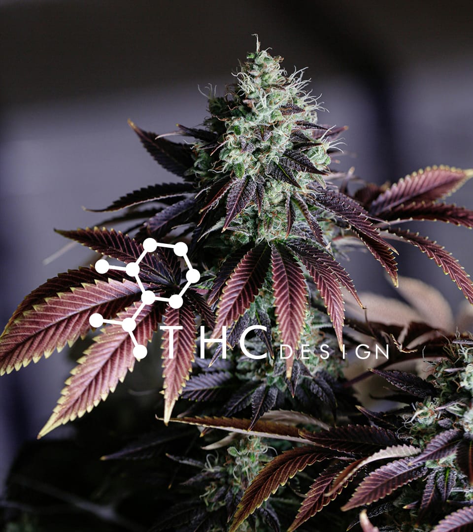
THC Design
OVERVIEW
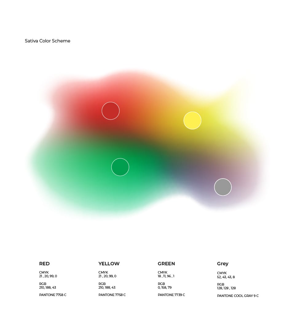
Built a clean, science-driven visual system inspired by the THC molecule, with a color palette that reflected indica, sativa, and hybrid strains.
YEAR
2015
SERVICE
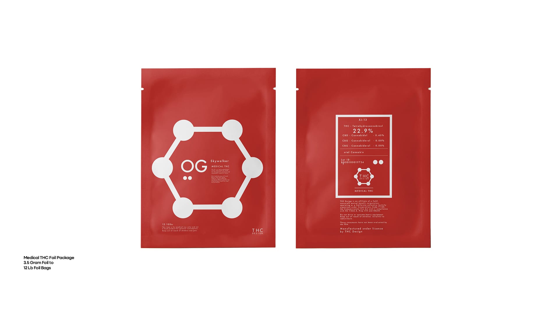
Logo + Package
Clean design. Controlled substance.
REGION & ZONE

Created the logo, identity, and packaging for a cannabis startup with a science-forward edge. The branding centered around the THC molecule and featured a modular color palette tied to indica, sativa, and hybrid strains. Minimal, modern, and built for clarity in a crowded space.

ABOUT
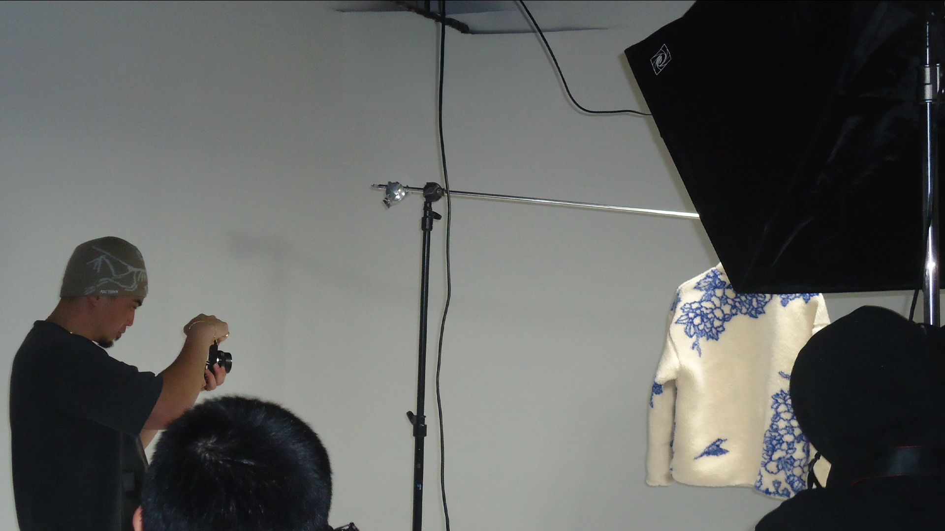
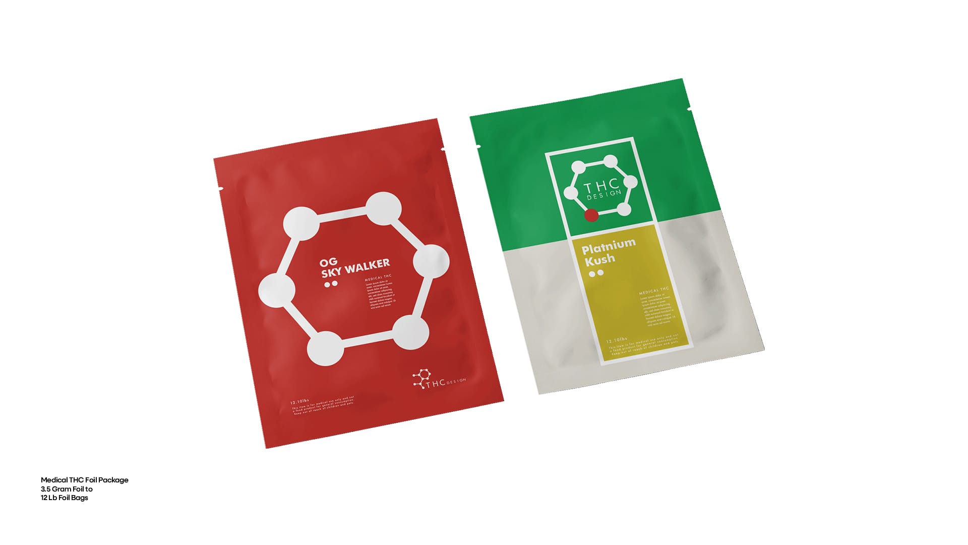
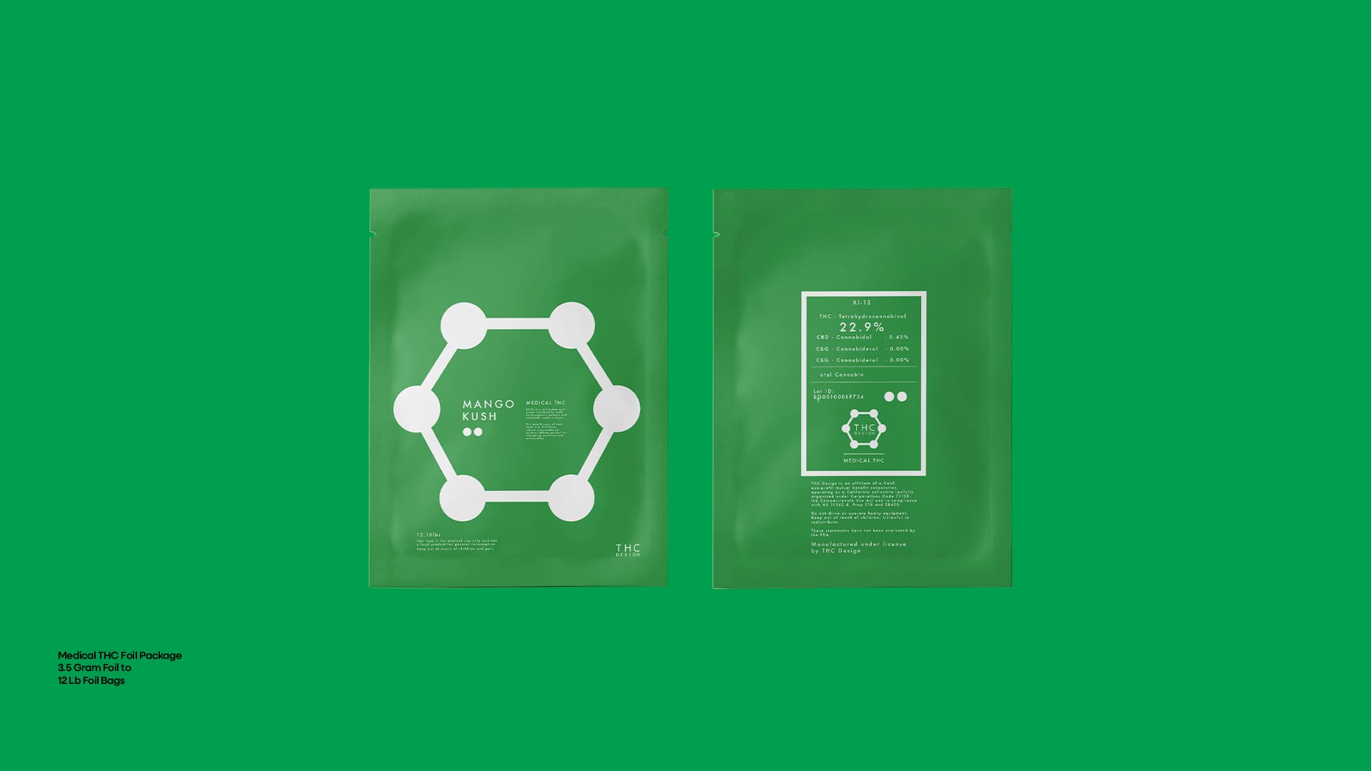
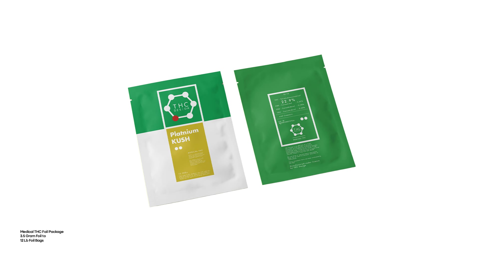
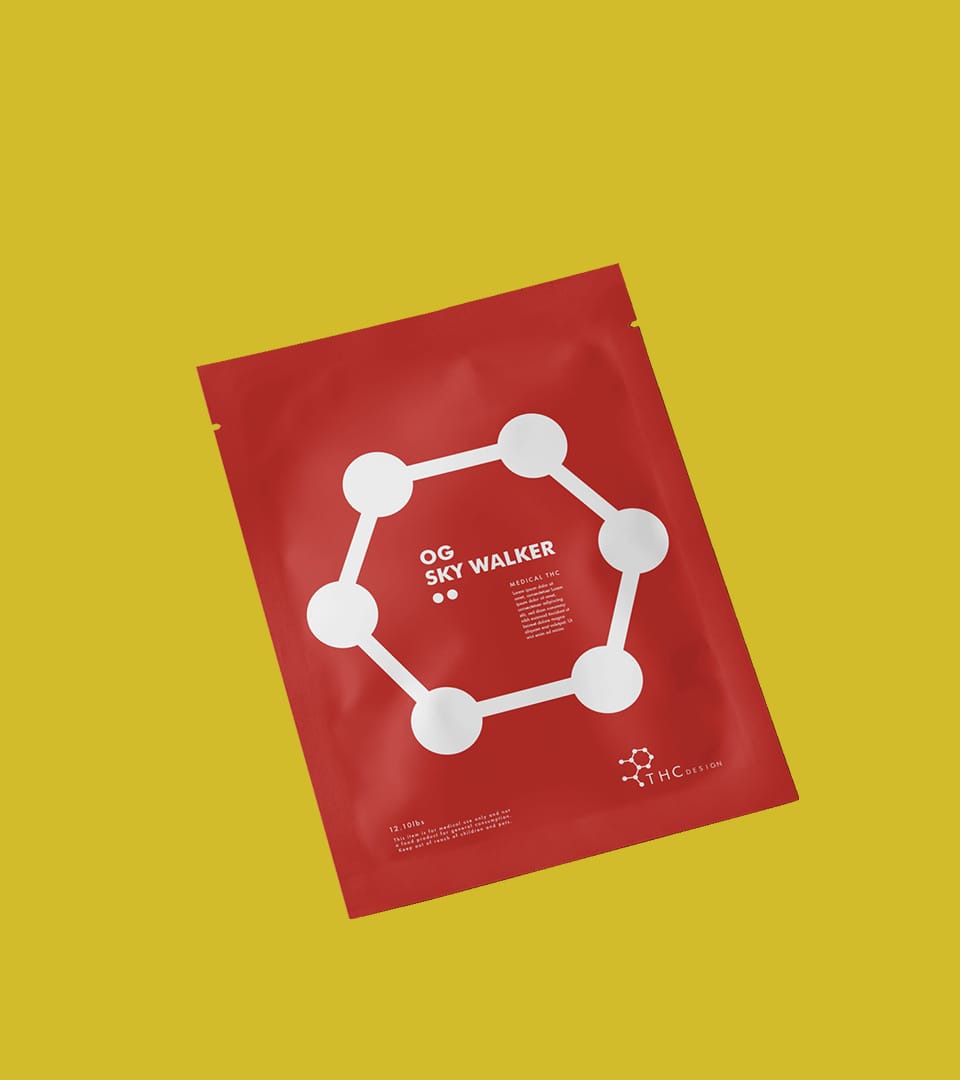
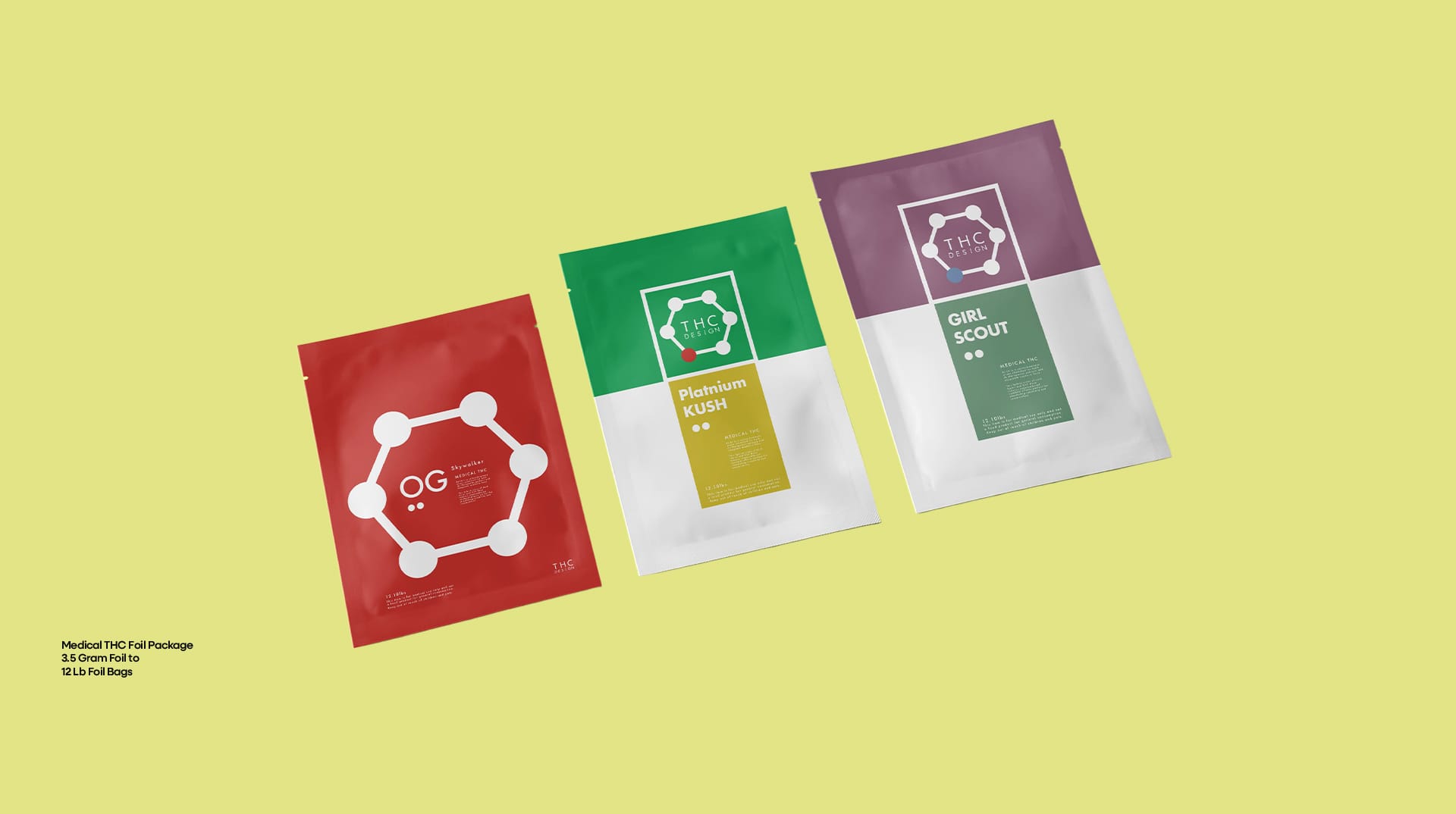
THC Design was an early-stage cannabis startup when I came on to create their initial logo, brand identity, and packaging system. At the time, the goal was to position the brand as a premium, science-forward player in a rapidly growing market. That meant taking a clean, minimal approach—something that felt more lab coat than head shop.
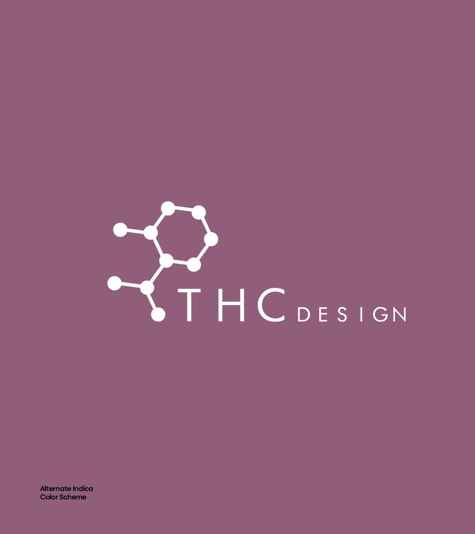
To support the identity system, I built a custom color palette that mapped directly to the two major cannabis strains: indica and sativa. The palette allowed for flexible pairing across products and packaging—especially for hybrid strains, where colors could be blended to represent the mix of effects. It gave the brand a clean visual logic that mirrored how the product lines worked.
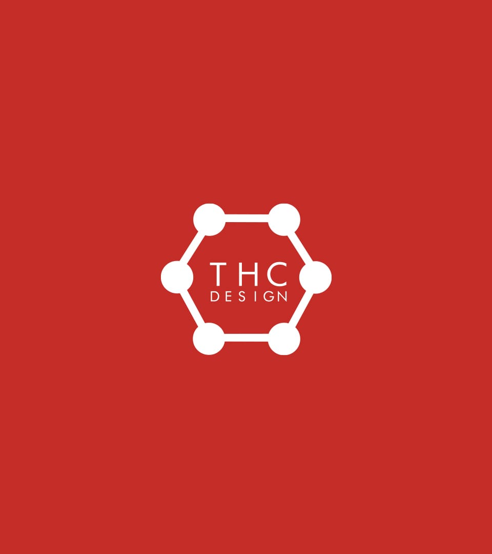
The logo itself was built around the THC molecule, giving it a subtle nod to the science behind the product without being overly literal. The typography and mark were designed to feel modern, balanced, and upscale, helping the brand stand apart from the overly busy or cliché cannabis visuals common at the time.
Overall, the work was all about clarity and consistency. No gimmicks—just smart design that let the science and quality speak for itself. It gave THC Design a strong foundation to grow from and helped set a tone that still feels relevant in today’s cannabis space.
Graphic Design
Logo
Branding
Storytelling
Package
FEATURES


No items found.